This Logo was designed by me back in 2012 and was uploaded in Behance then. At that time, I wanted to use in my photography work as a watermark as well as making an identity for myself as a wildlife photographer and a UX designer.
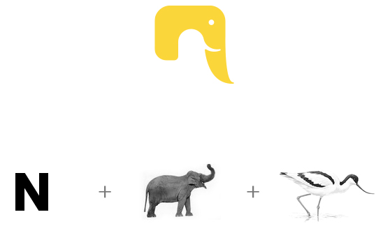
As I mainly take photos of mammals and birds, I wanted to incorporate both into the logo and also wanted to project the ‘N’ of Neelakandan. Also wanted the whole work to display my design skills.
IDEA
The idea behind was to incorporate the small letter ‘n’ + ‘elephant’ + ‘Avocet (Avocet as, the elephant tusk and the beak of Avocet are of the same shape)’.
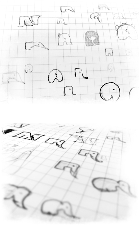
SKETCHES
Multiple sketches were made with many ideas other than the above.
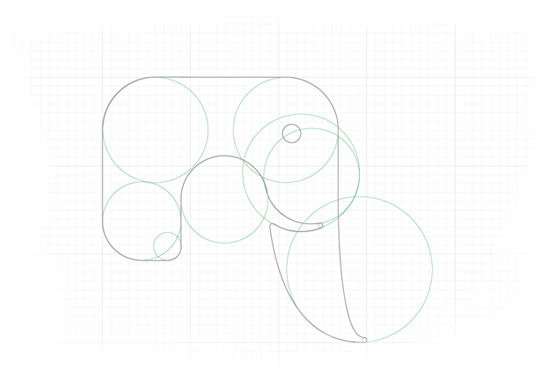
DIGITALISATION
Once the idea was finalised, it was time to digitalise the same. Initially, I thought of combining both hard shapes and round, and finally, circles were all the logo was made of.
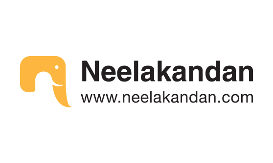
LOGO WITH TEXT
Choosing typography was a huge challenge. Finally, a font was chosen and customised to the requirement.
This logo has been appreciated worldwide, Had been featured in many online logo magazines and has also been published in various logo reference international publications.

Awesome post! Keep up the great work! 🙂